I Tested 6 AI Image Outputs With the Same Prompt — Here's What Actually Separated the Winners
By Soumya Ranjan Sahoo · · 7 min read
#AI Image Generation#Prompt Engineering#AI Tools#Image Models#Commentary
I ran one deliberately overloaded prompt through 6 AI image outputs and judged them blind on prompt adherence, anatomy, lighting, and storytelling. The winner wasn't the prettiest — it was the most coherent. Here's what actually separated a 79 from a 96.
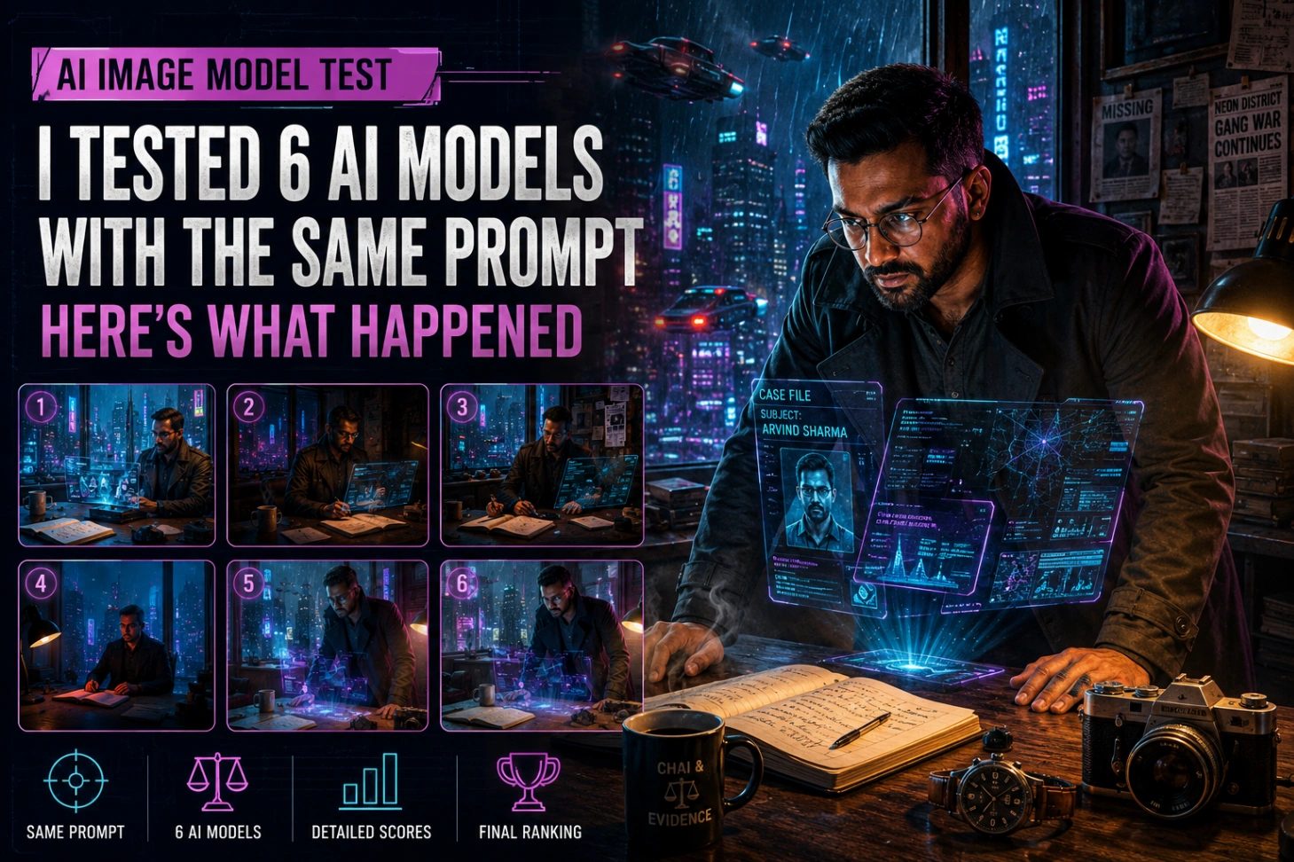
I Tested 6 AI Image Outputs With the Same Prompt — Here's What Actually Separated the Winners AI image generation has come a long way. Models that once mangled hands, scrambled text, and lost track of basic objects can now produce frames that look like they were pulled straight from a movie poster. But "impressive" and "accurate" aren't the same thing. So I ran an experiment: instead of testing models with a throwaway prompt like "a cat sitting on a chair," I wrote one deliberately overloaded prompt — designed to stress-test composition, anatomy, lighting, object consistency, and storytelling all at once — and judged every output against it, blind, using a fixed rubric. Here's what happened. --- The Prompt > A cinematic cyberpunk detective office at night during heavy rain, viewed from a slightly elevated angle. A 35-year-old Indian detective with short hair and a trimmed beard sits at a wooden desk, wearing a dark trench coat and round glasses. He is examining holographic crime evidence projected above the desk. > > Behind him, a large window shows a futuristic neon city with flying cars and rain droplets running down the glass. On the desk are an open notebook with handwritten notes, a steaming cup of coffee, a mechanical wristwatch showing 10:15 PM, and a vintage camera. > > A black cat sleeps on a leather chair nearby. The room is illuminated by blue and magenta neon lights mixed with warm desk-lamp lighting, creating realistic shadows and reflections. > > Ultra-realistic, cinematic color grading, volumetric lighting, shallow depth of field, highly detailed textures, ray-traced reflections, 8K quality, photographed with a Sony A7R V and 50mm lens, f/1.8. > > No extra fingers, anatomically correct hands, realistic eyes, natural proportions, physically accurate reflections, consistent perspective. That's 19 distinct requirements packed into one prompt. Most models nail 12–14 of them. The ones that separate themselves nail the relationships between elements — not just the checklist. --- How I Scored Each Image Every output was judged blind against a fixed rubric, so no model got the benefit of context or excuses. | Category | Weight | | -------------------------- | ------ | | Prompt Adherence | 30% | | Composition & Perspective | 15% | | Lighting & Atmosphere | 15% | | Anatomy & Hands | 15% | | Object Consistency | 10% | | Fine Details & Textures | 10% | | Artistic Impact | 5% | --- Image #1 — Strong All-Rounder(Model - Nano banana2_gemini_platform) Score: 91/100 !image.png?alt=media&token=a2dcae74-f65a-407b-b721-df677cd8dd86) This one captured most of the brief competently, with no glaring failures. Strengths: convincing cyberpunk-rain atmosphere, a believable detective, strong lighting, clean reflections, and every required prop (cat, camera, notebook, coffee) present and correct. Weaknesses: an oversized wristwatch, slightly stiff object arrangement, and holograms that read as "cinematic effect" rather than something physically occupying the room. Verdict: solid promotional-artwork quality, but it plays it safe. --- Image #2 — The Storytelling Champion(Model - GPT5_openai) Score: 95/100 !image.png?alt=media&token=b5ab8f4c-9874-41f2-a587-0233b4acae12) This is the one that didn't just follow instructions — it built a scene. Newspaper clippings, a missing-persons poster, and scattered case files turned the desk into evidence of an active investigation rather than a styled set. The detective looked like he was mid-case, not posing for a portrait. Strengths: exceptional atmosphere, excellent composition, surprisingly legible background text, real emotional weight. Weaknesses: the same oversized watch, a composition almost too tidy, and holograms still firmly in "cinematic" rather than "physical" territory. Verdict: feels like a freeze-frame from a Netflix cyberpunk thriller — the strongest narrative of the set. --- Image #3 — Beautiful but Unconvincing(Model - ideogram_4.0) Score: 88/100 !image Technically polished, but the seams showed. Main issues: weak hand anatomy, holographic panels that floated disconnected from the desk, a toy-proportioned camera, and noticeably less storytelling than #1 or #2. Verdict: great as a desktop wallpaper, weak as a "scene." This is what happens when a model nails texture but not physics. --- Image #4 — The Most Photographic, the Least Accurate(Model - Image_3.0_kimi) Score: 79/100 !image Ironically, the image that looked most like a real photograph adhered to the prompt the least. Major elements simply didn't show up: no holographic evidence, no flying cars, a city skyline that read as modern rather than cyberpunk. What remained was a moody, well-lit portrait of a man at a desk — pleasant, but not the brief. Verdict: a reminder that realism and prompt fidelity are two completely different axes. A model can excel at one while quietly failing the other. --- Image #5 — The Atmosphere Master(Model - gemini_nanobanan_pro) Score: 93/100 !image Swapping the detective from seated to standing did more for this image than any lighting tweak could have. The posture alone injected urgency. Strengths: outstanding lighting, holograms that finally felt integrated into the desk rather than pasted on top, strong storytelling, and the best overall balance of any image besides the winner. Weaknesses: an unused, slightly empty left side of the frame, and — predictably — that watch again. Verdict: this one reads like AAA game concept art. Close, but not quite the top spot. --- Image #6 — The Winner(Model - nanobanana_pro_GoogleFlow_platform) Score: 96/100 !image This is the image that got almost everything right at once. Composition that actually directs the eye Every object sat along a deliberate visual path: Nothing fought for attention. Nothing felt arranged purely for the sake of looking arranged. Lighting that did real work Four light sources — blue rain-glow, magenta neon, a warm desk lamp, and the hologram's own glow — interacted with each other instead of just sitting next to each other. That interaction is what created the depth. Storytelling that held up without the prompt Where Image #4 needed the caption to make sense, this one didn't. The detective's lean, the hologram's placement, the cluttered-but-intentional desk — it read as "mid-investigation" on sight. Verdict: the most complete output of the six, and the only one that balanced every category instead of excelling in two and coasting on the rest. --- The Artifacts Every Model Kept Making Across all six images, the same tells showed up again and again — useful to know if you're trying to spot AI-generated work in the wild. Oversized wristwatches. Every single image gave the detective a comically large watch. No idea why, but it's consistent enough to be a tell on its own. Movie-poster syndrome. Every desk was too clean. Real offices have cable clutter, dust, and mess — these all looked staged for a photoshoot. Unconvincing hologram physics. Visually stunning in every version, but none of them rendered light or shadow the way an actual projected hologram would behave. Excessive sharpness. Several images were crisper than a real 50mm f/1.8 shot would ever produce — ironic, given the prompt explicitly asked for shallow depth of field. --- Final Rankings | Rank | Image | Score | | ---- | -------- | ----- | | 🥇 | Image #6 | 96 | | 🥈 | Image #2 | 95 | | 🥉 | Image #5 | 93 | | 4 | Image #1 | 91 | | 5 | Image #3 | 88 | | 6 | Image #4 | 79 | --- What This Actually Tells Us The gap between today's leading image models is shrinking fast. Almost all of them can produce something cinematic, detailed, and visually striking on the first try. What still separates a good output from a great one isn't beauty — it's coherence: hands that hold weight correctly, light sources that talk to each other, objects that feel placed rather than dropped in, and a scene that tells its story even without the prompt sitting next to it. Beautiful images are easy now. Consistent, story-coherent images are still hard. And no matter how good the model gets — it will, without fail, give your detective an enormous wristwatch.